
You don’t need to see the logo to know it’s McDonald’s. Sometimes, you don’t even need to see the product.
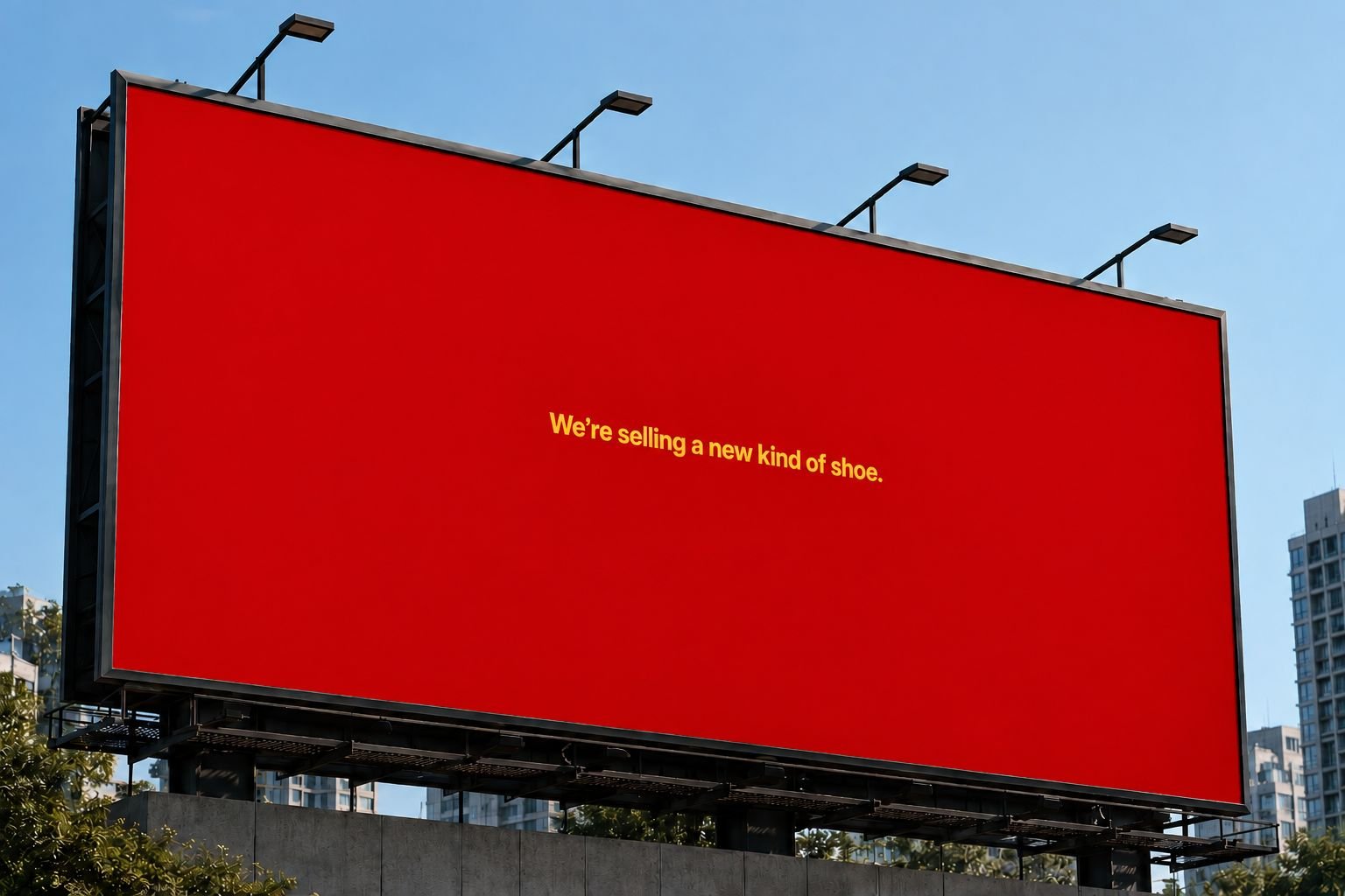
Take a red hoarding with a little yellow text. Nothing else. No burger. No fries. No Golden Arches. And yet, there’s a good chance your brain goes: McDonald’s.
That’s what happens when a brand builds its visual identity consistently enough. The colours stop being just colours. They become part of the brand.
The experiment
So I tried a simple experiment. I took that familiar McDonald’s colour combination and used it to advertise something completely unrelated:
“We’re selling a new kind of shoe.”
No McDonald’s logo. No food. No burger. Just a shoe-related message on a red-and-yellow hoarding. And yet, the first association can still be McDonald’s.
What it shows
That’s the interesting part about strong brand identity. When your visual language is distinctive enough, people can recognise the brand even when the product, message and logo have nothing to do with it.
The strongest identities don’t need to introduce themselves.
They’ve already made an impression.