
IDENTITY / PACKAGING — 2026
CANTINA — WOODFIRE
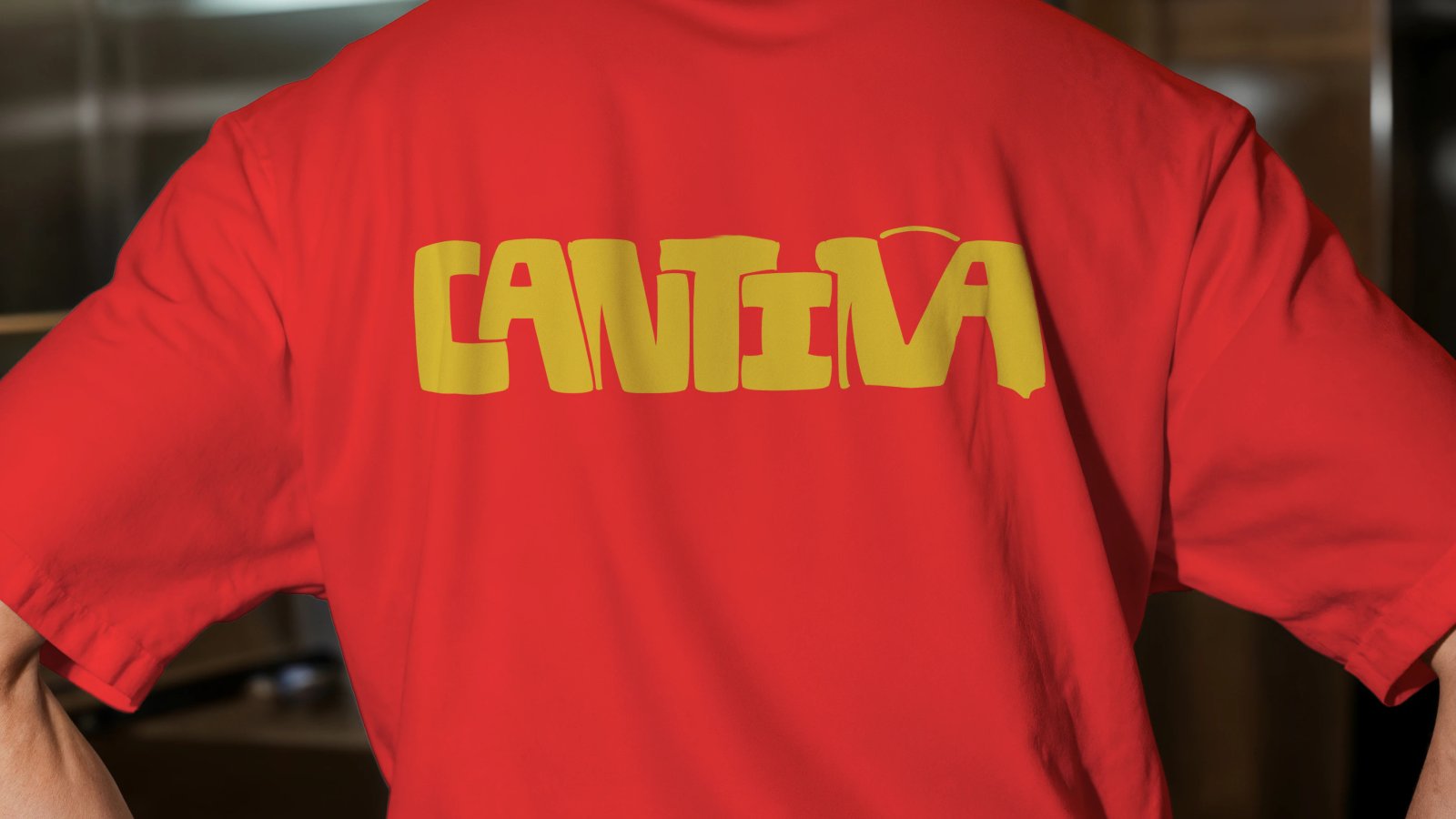
A punchy identity and illustration system for a woodfire pizza concept.

THE BRIEF
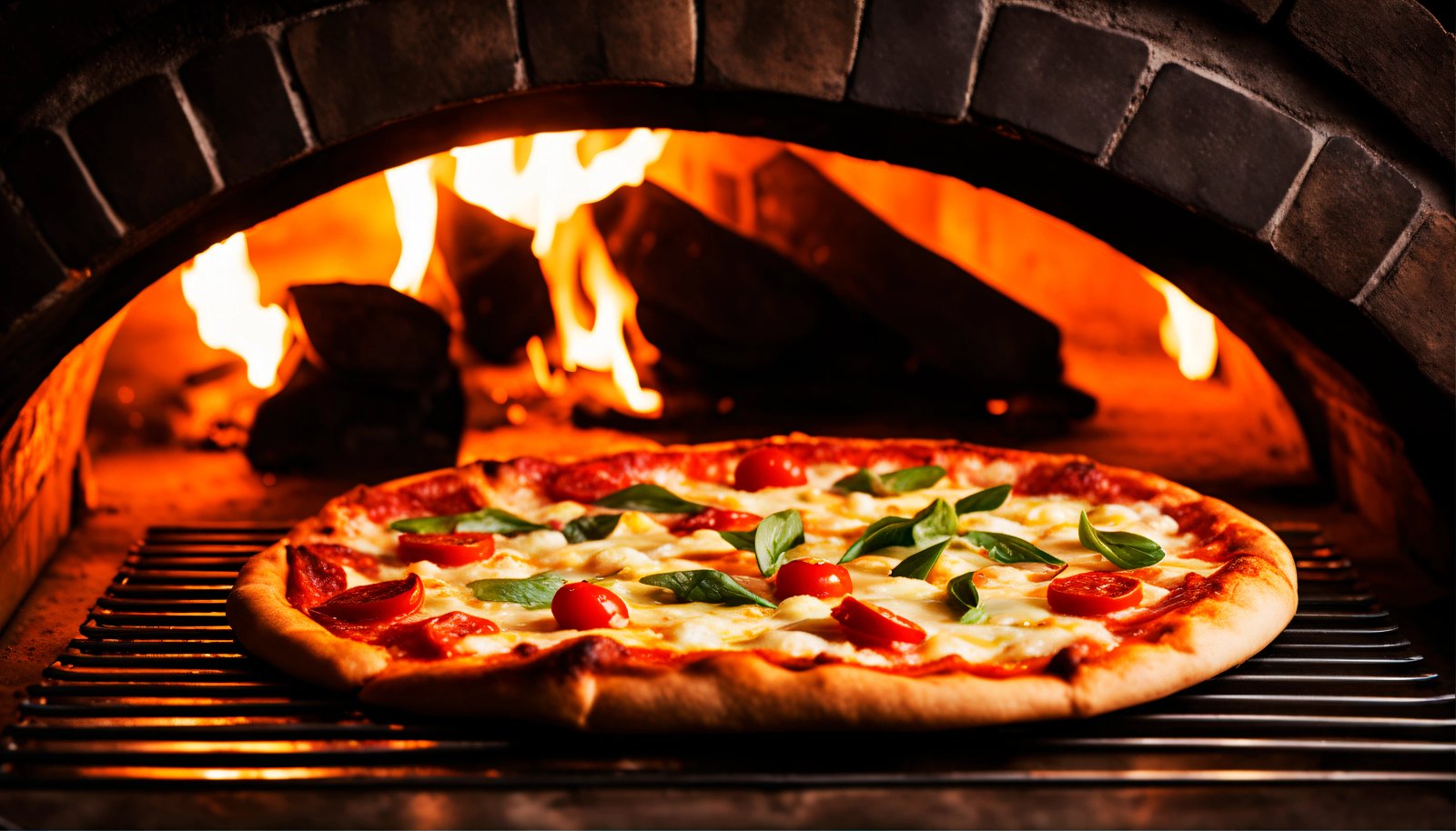
A woodfire pizza concept that needed an identity bold enough to compete with the noise of a busy street, and warm enough to make you want to walk in.
THE BUILD
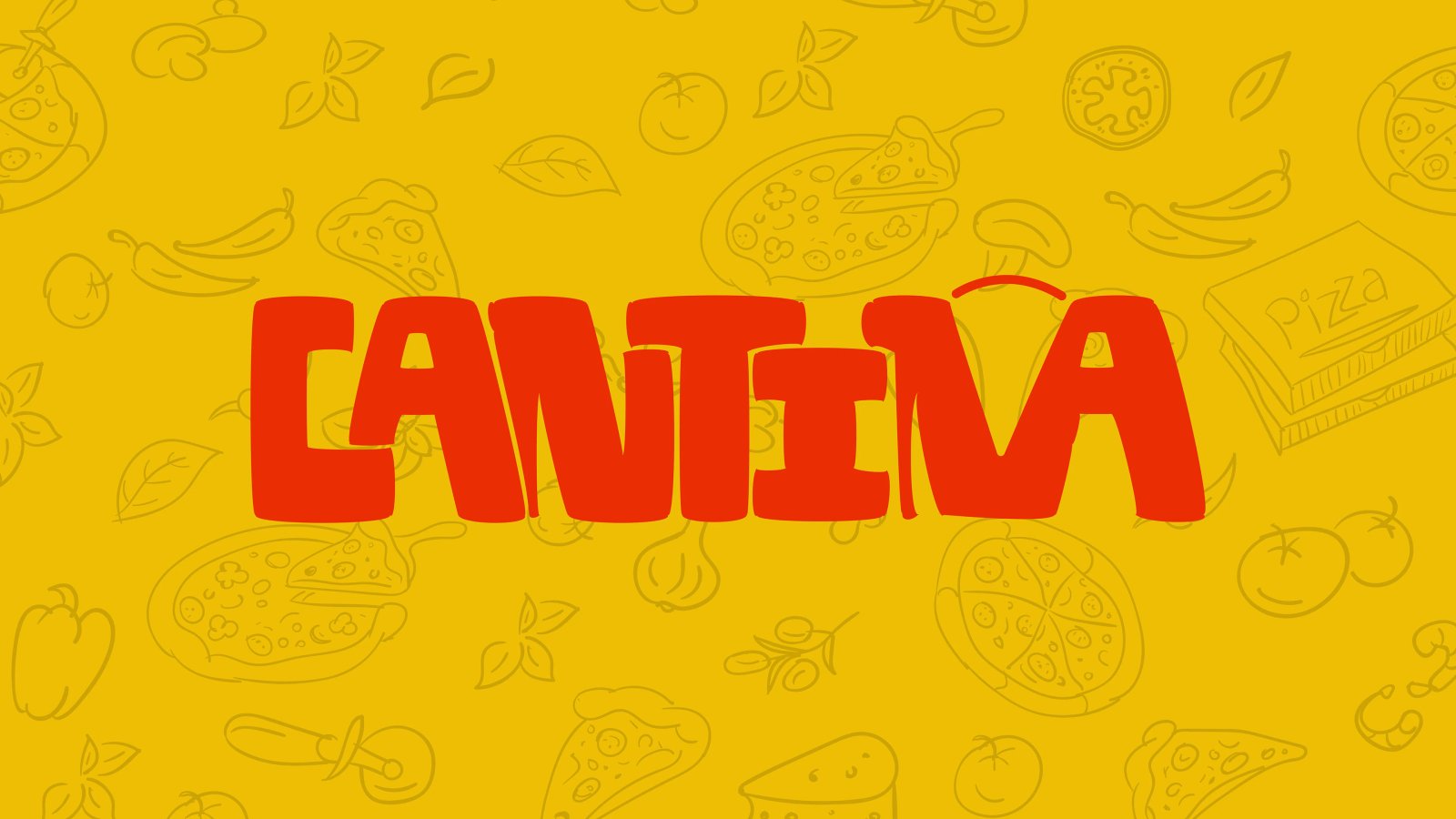
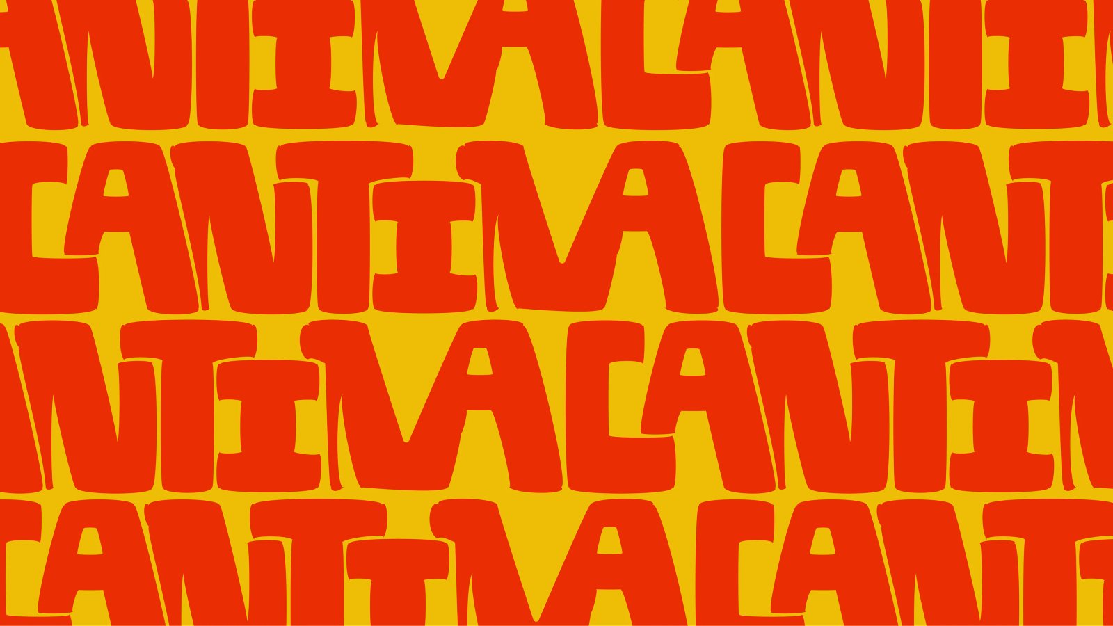
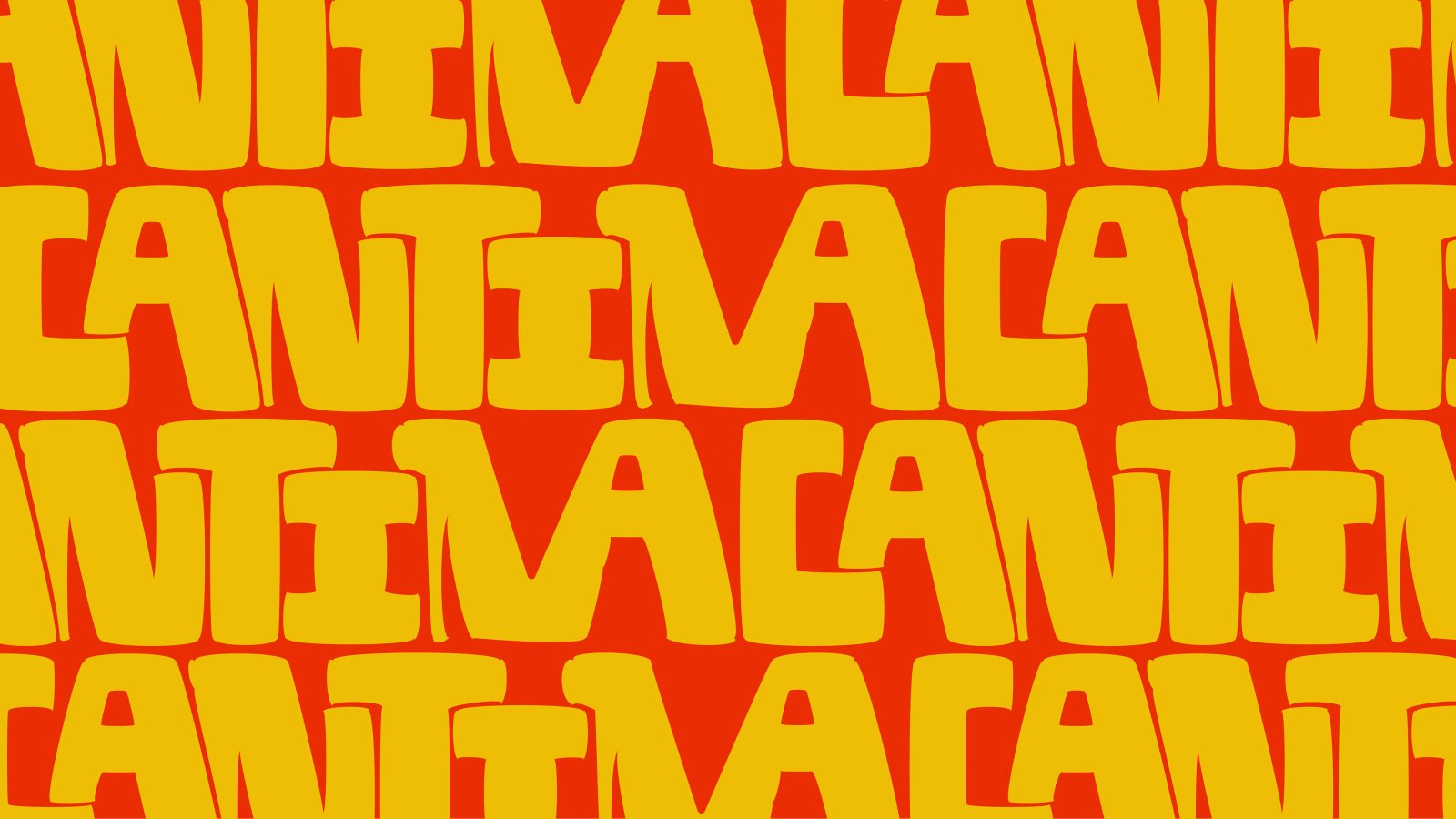
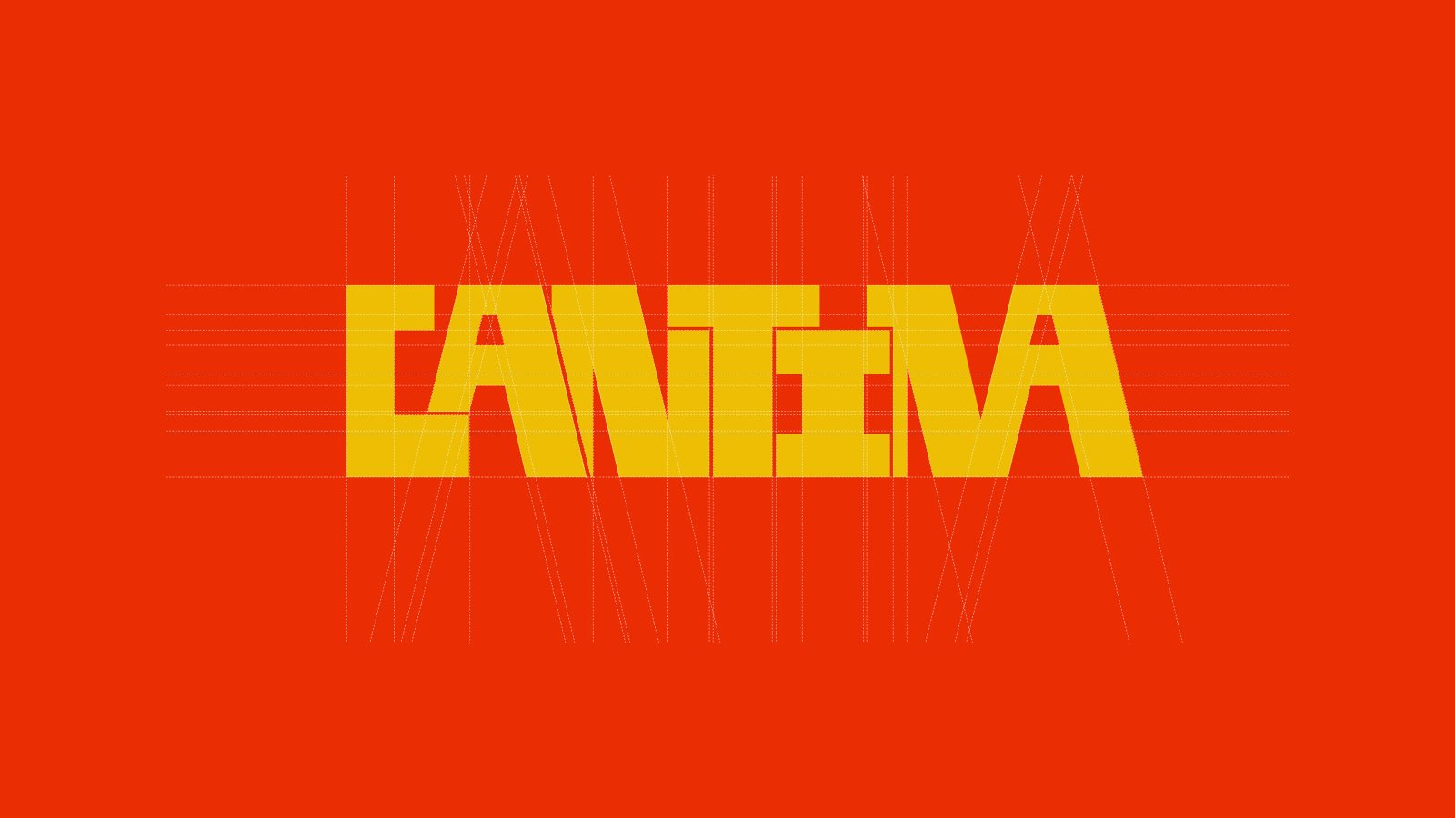
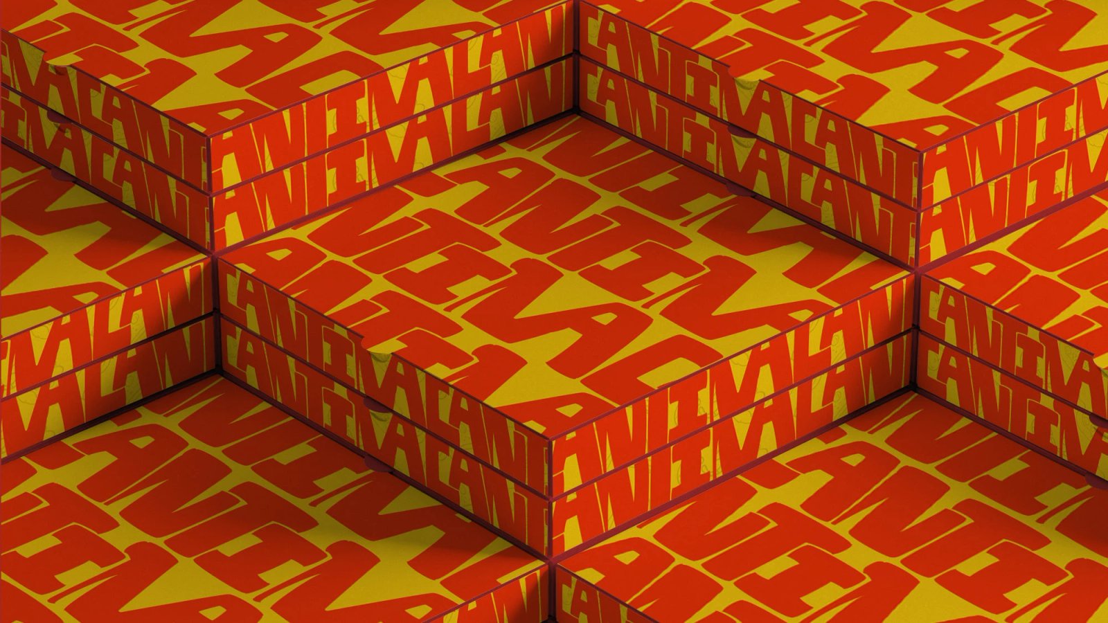
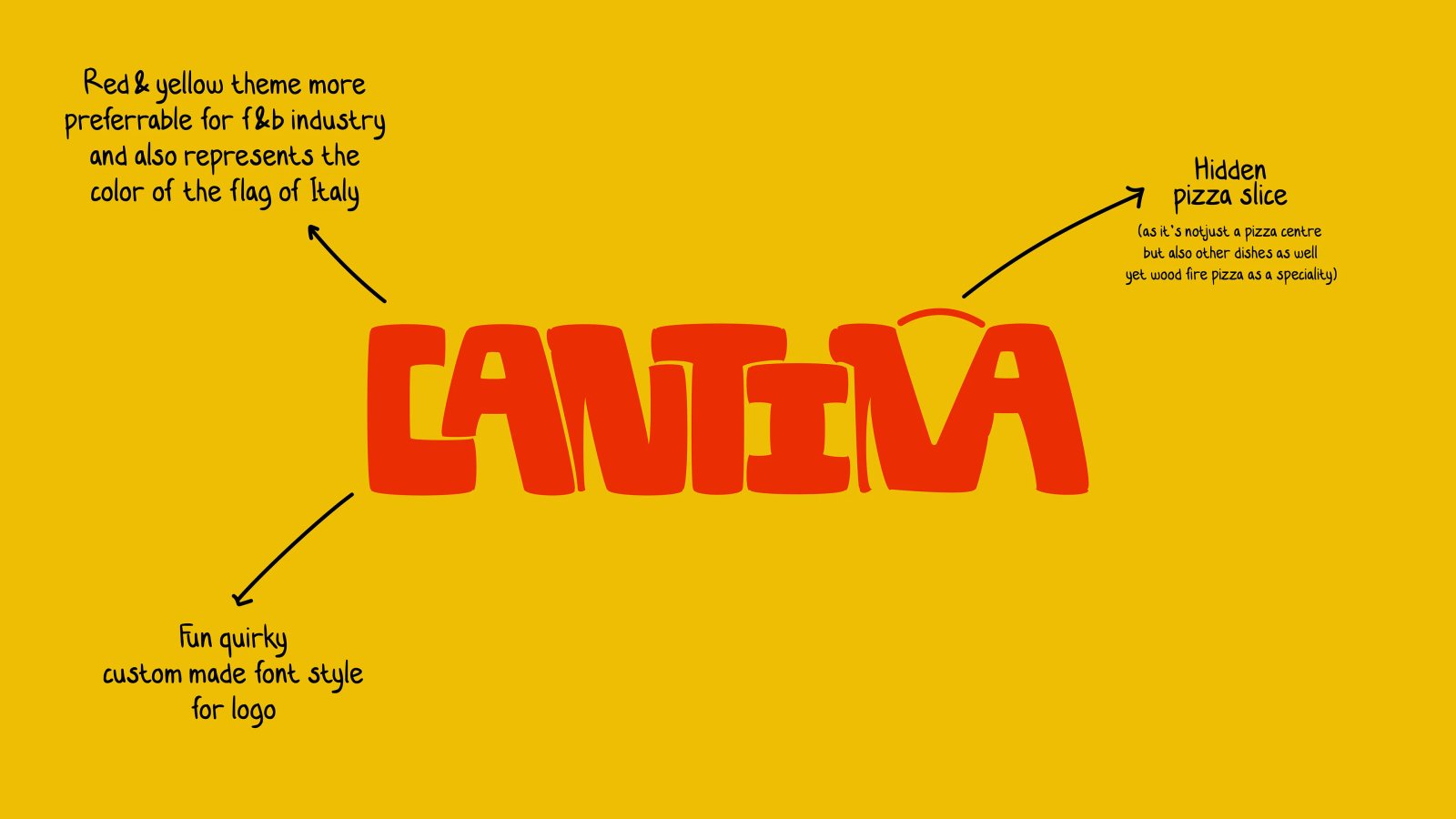
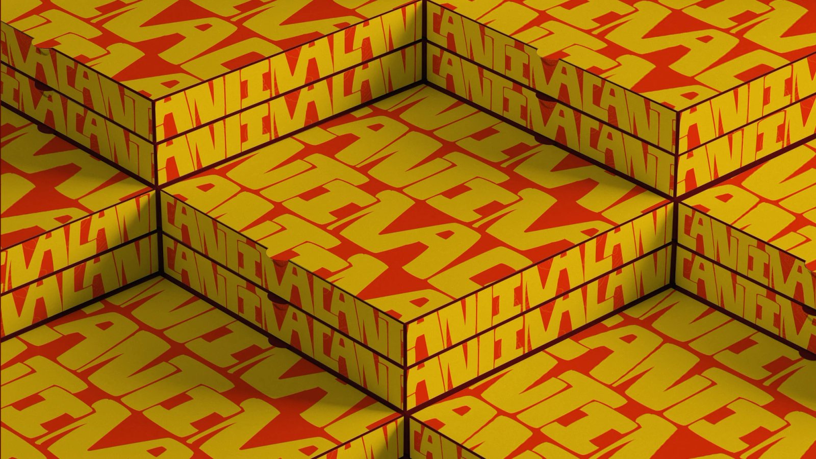
We built a thick, hand-drawn wordmark, a recurring illustration system drawn from the kitchen itself, and applied it across signage, packaging and menus. Loud, warm, unmistakably food.
DELIVERABLES
- WORDMARK
- ILLUSTRATION SYSTEM
- PACKAGING
- MENU DESIGN
- SIGNAGE