
ART DIRECTION / CAMPAIGN — 2024
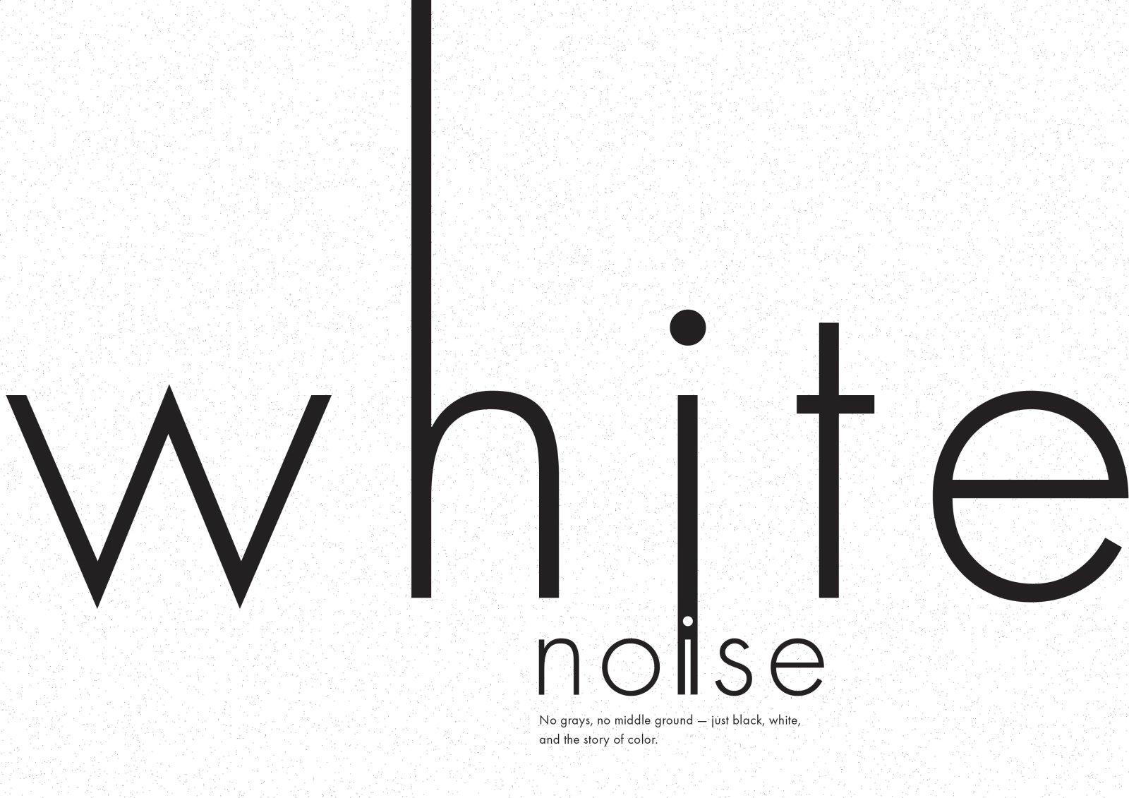
WHITE NOISE
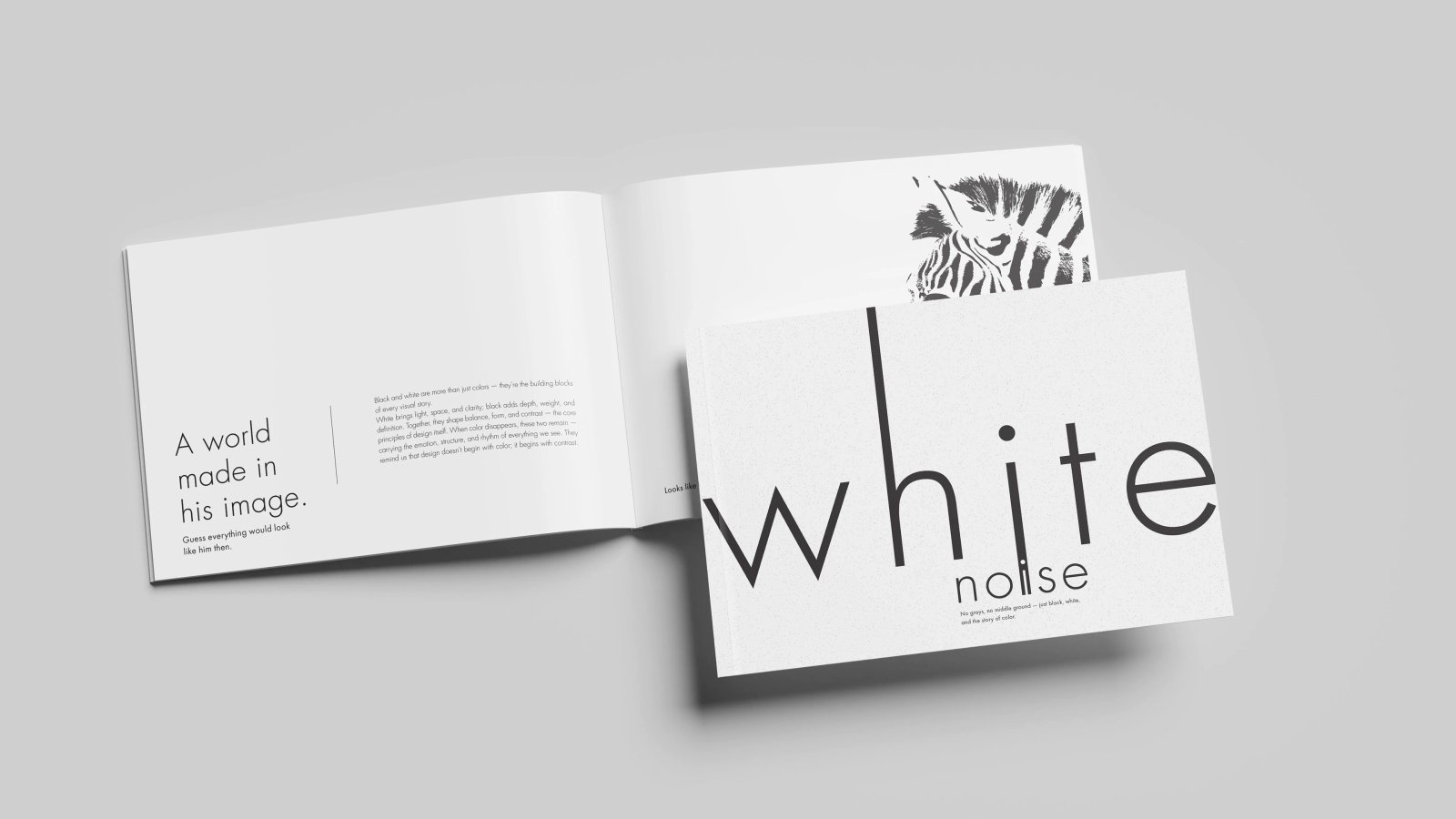
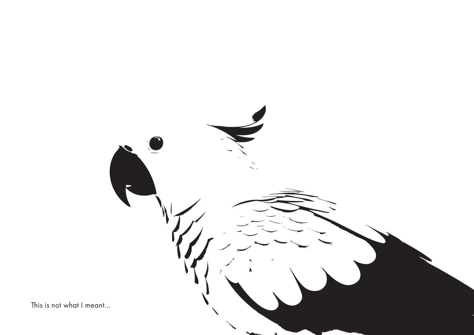
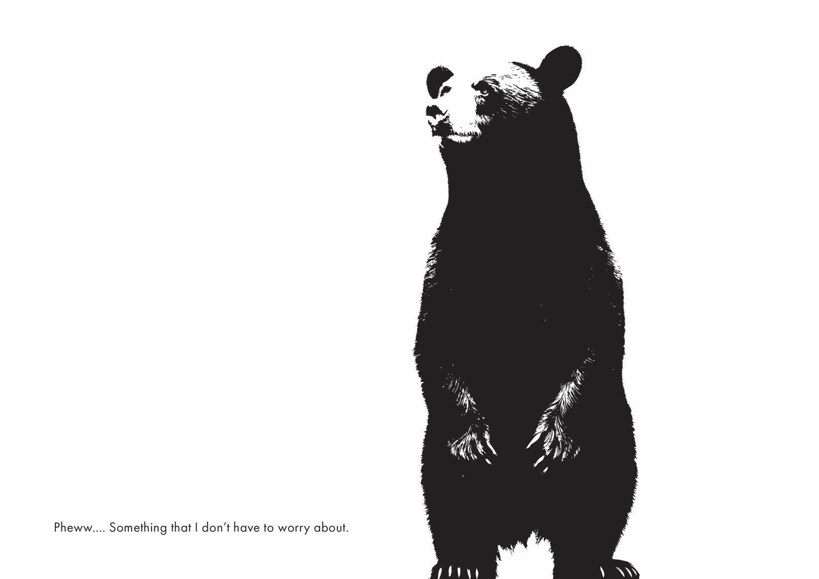
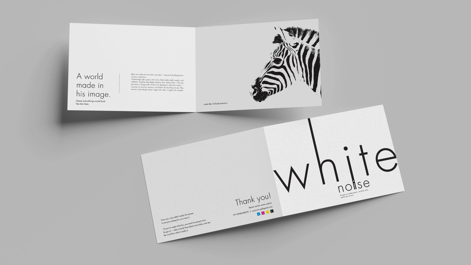
A stark, high-contrast art direction system for White Noise — built to cut through a loud, over-saturated feed.
THE BRIEF
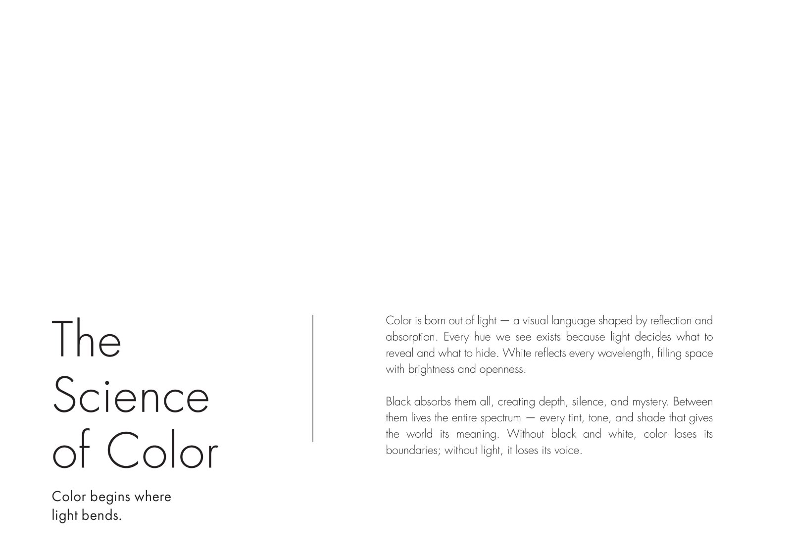
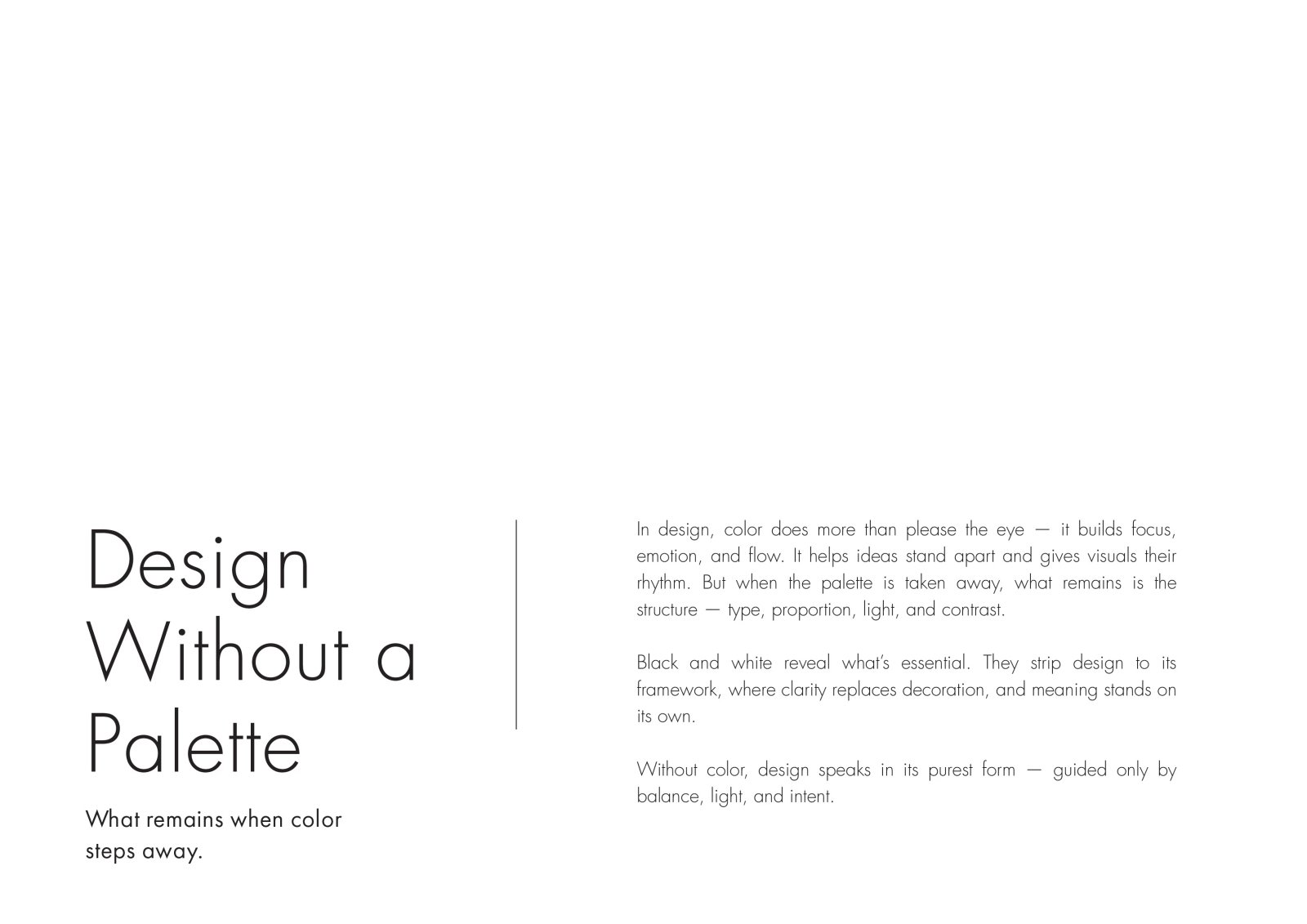
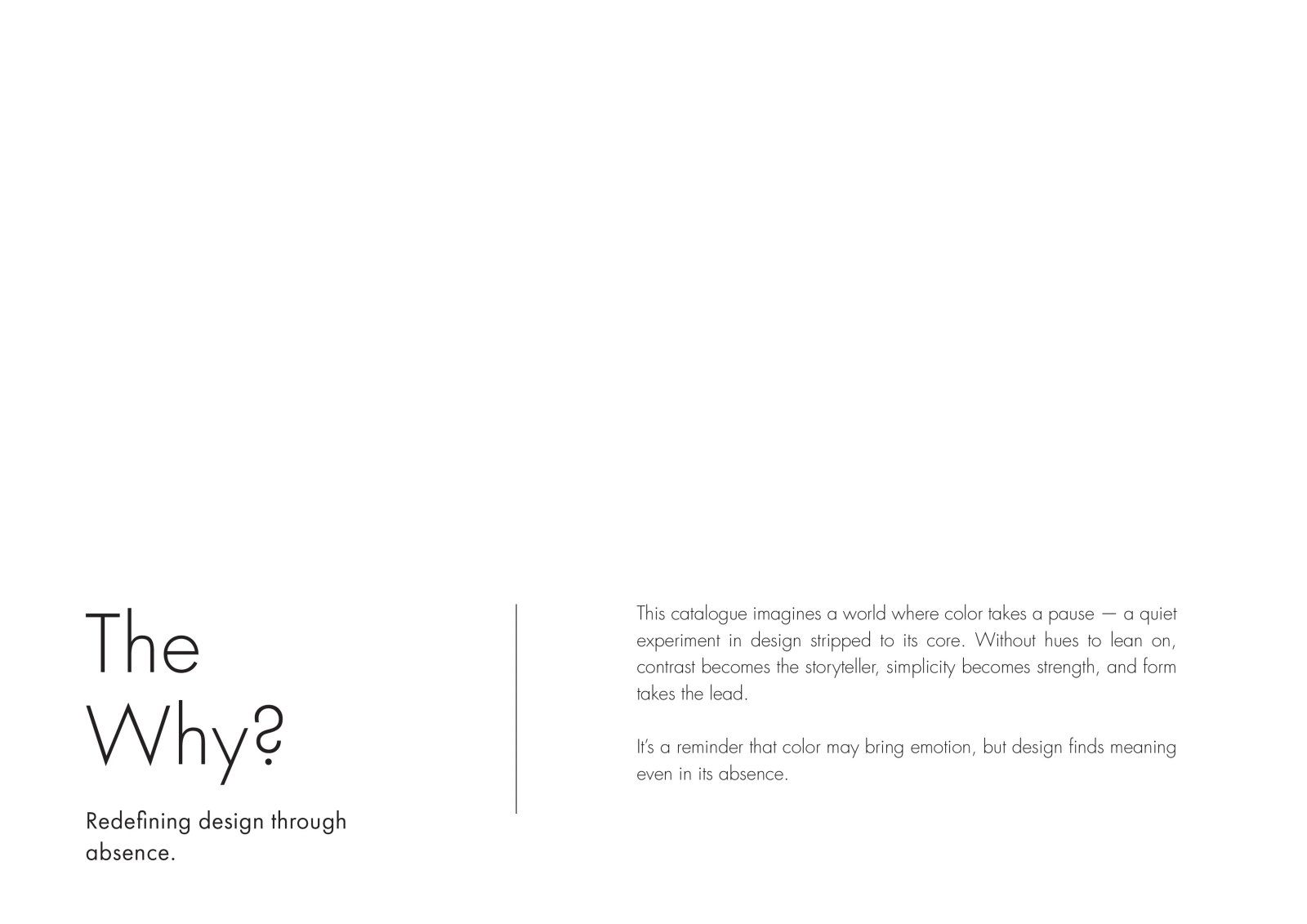
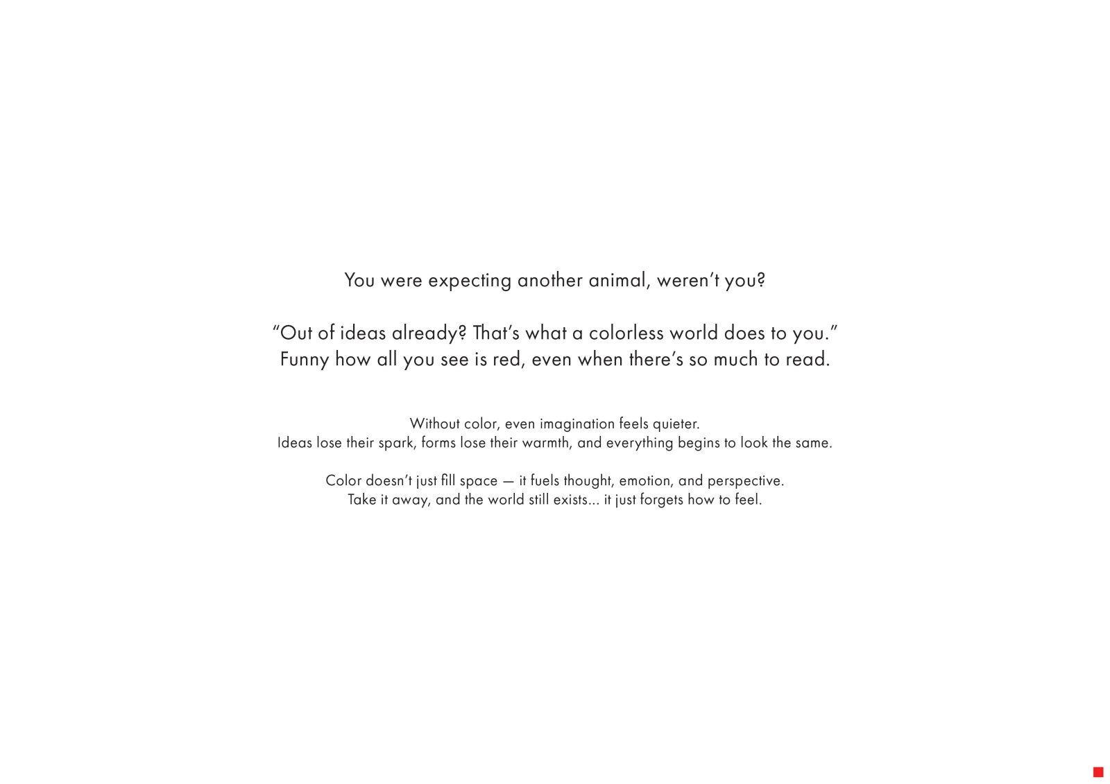
White Noise needed a visual language that felt loud without turning into chaos — a system that could carry across campaign key visuals, social cutdowns and print while staying recognisable in a crowded feed.
THE BUILD
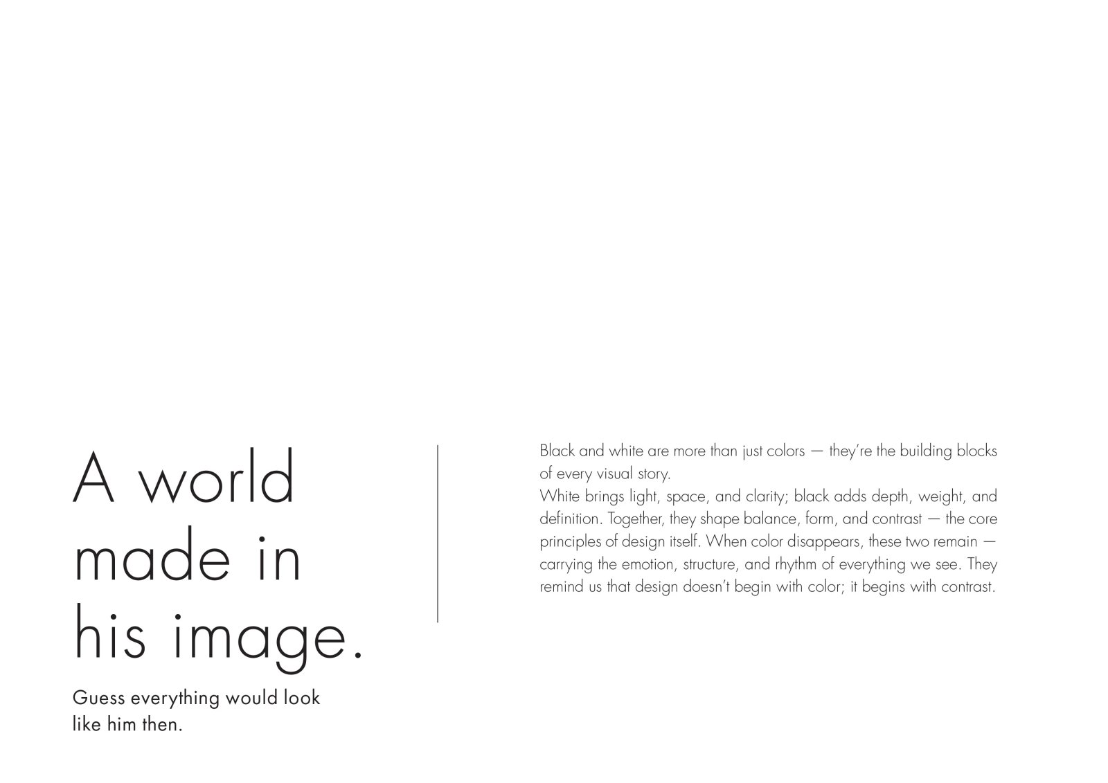
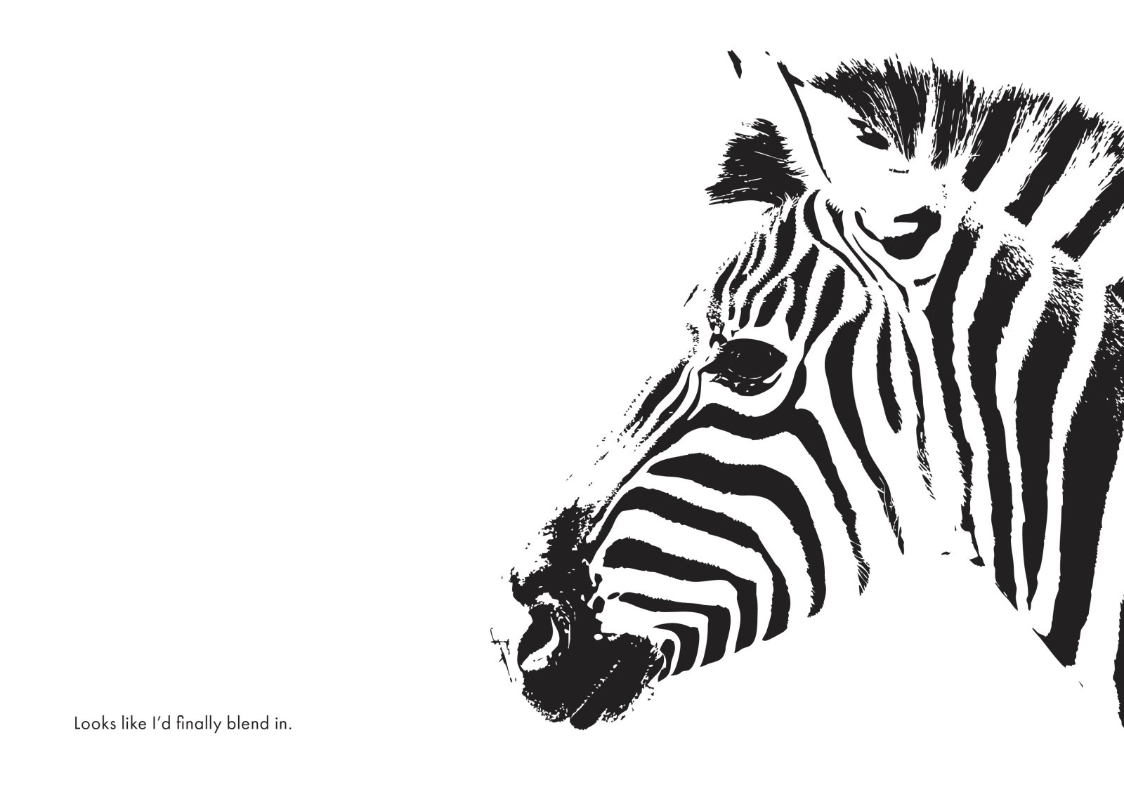
We built the direction around hard contrast, tight crops and a restrained type system, then pushed it through a full set of campaign key visuals, social assets and print applications.
DELIVERABLES
- ART DIRECTION
- KEY VISUALS
- SOCIAL SYSTEM
- PRINT COLLATERAL
- RETOUCH